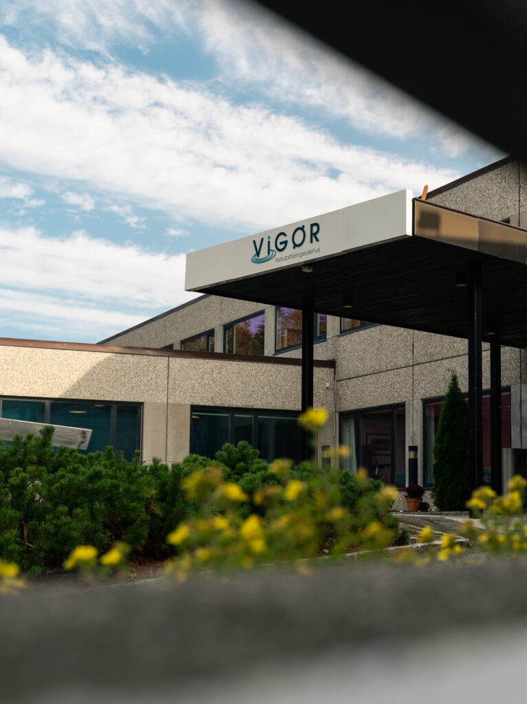
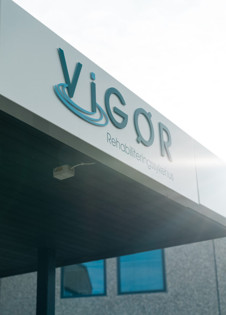
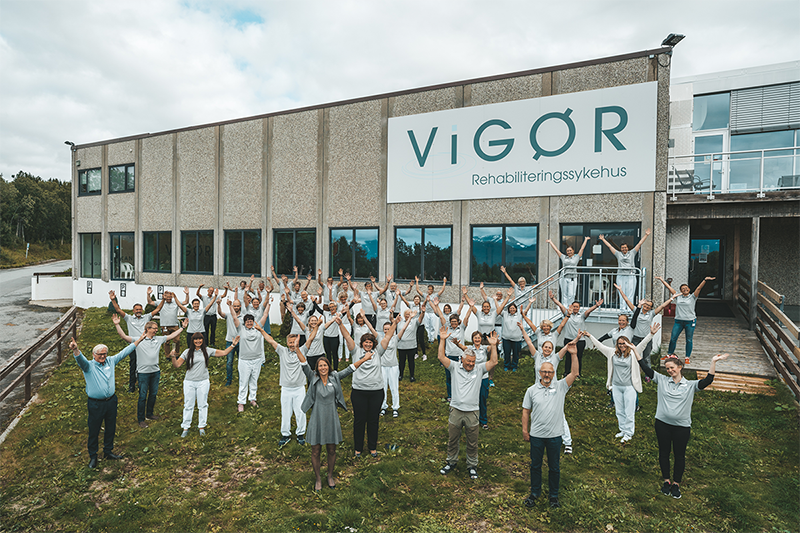
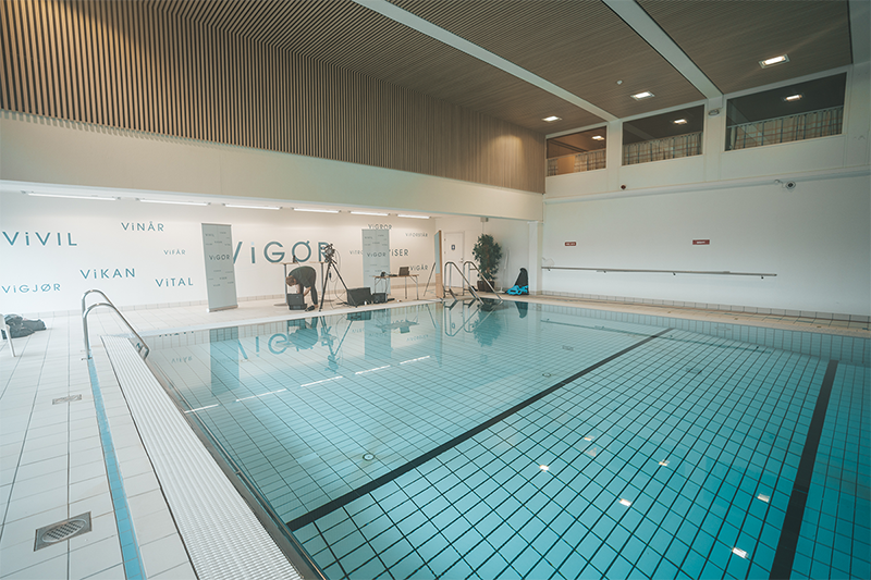
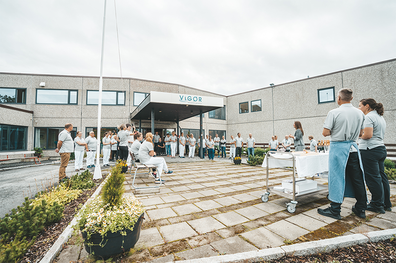
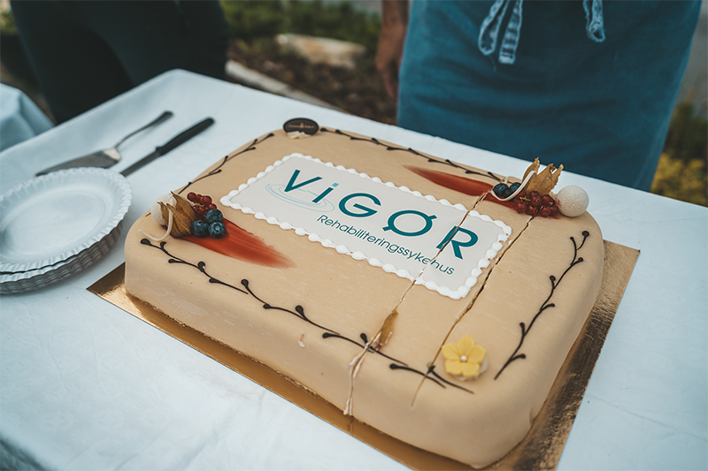
Vigør is a national rehabilitation centre providing musculoskeletal, neurological, and work-oriented care.
As the organisation expanded, environmental, communication, and identity systems evolved independently. This created conflicting navigation cues across entrances, reception areas, and corridor junctions, critical decision points where users must orient themselves quickly under physical or emotional strain.
I led the design of a unified navigation system spanning environmental, communication, and identity layers, aligning all touchpoints into a single interpretive structure.
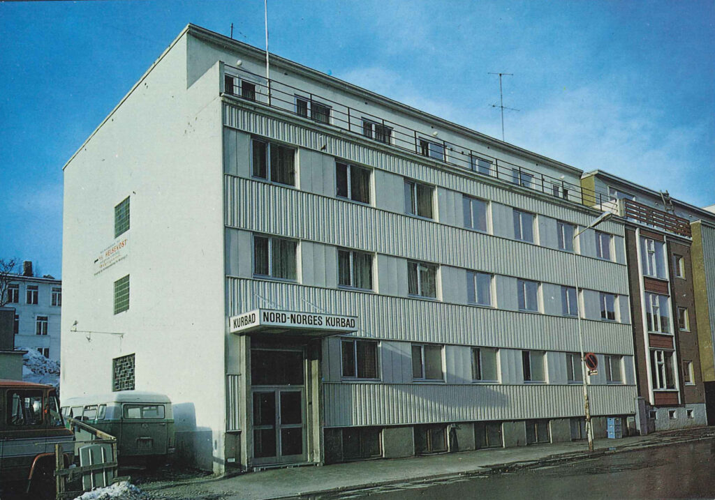
Vigør was established by the Adventist community in 1952 under the name Nord-Norges Kurbad, most often called ‘Kurbadet’ in colloquial terms.
Problem
Navigation failures occurred at three key moments:
entrances (initial orientation)
corridor junctions (route decisions)
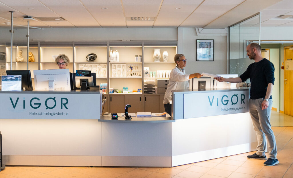
reception areas (service identification)
Users encountered inconsistent hierarchy across signage, naming, and communication systems, requiring repeated interpretation under time pressure.
This led to hesitation at decision points, frequent re-orientation, and reliance on staff support for basic navigation tasks.
Key Insight
Breakdowns were not caused by missing information, but by inconsistent expression of hierarchy across systems.
At the same decision point, different channels (signage, spatial cues, communication materials) communicated priority differently.
This created interpretive friction in environments where users needed immediate clarity.
The challenge was therefore not signage design, but alignment of decision logic across systems.
Approach
I mapped the environment as a continuous decision system, focusing on:
where decisions occur (nodes)
what information competes at those nodes
how hierarchy shifts across systems
This revealed that users were not lost spatially, but forced to reconcile conflicting “reading orders” across identity, spatial, and communication layers.
The solution required establishing a single hierarchy model governing all three systems.
Design Strategy
A single navigation framework was implemented across three integrated layers:
Environmental UX system
A three-level navigation structure was defined:
directional cues (movement through space)
confirmation cues (continuity validation)
destination cues (final endpoints)
Tradeoff: We reduced informational richness at junctions to prevent cognitive overload, prioritising decision speed over completeness of information.
Communication system
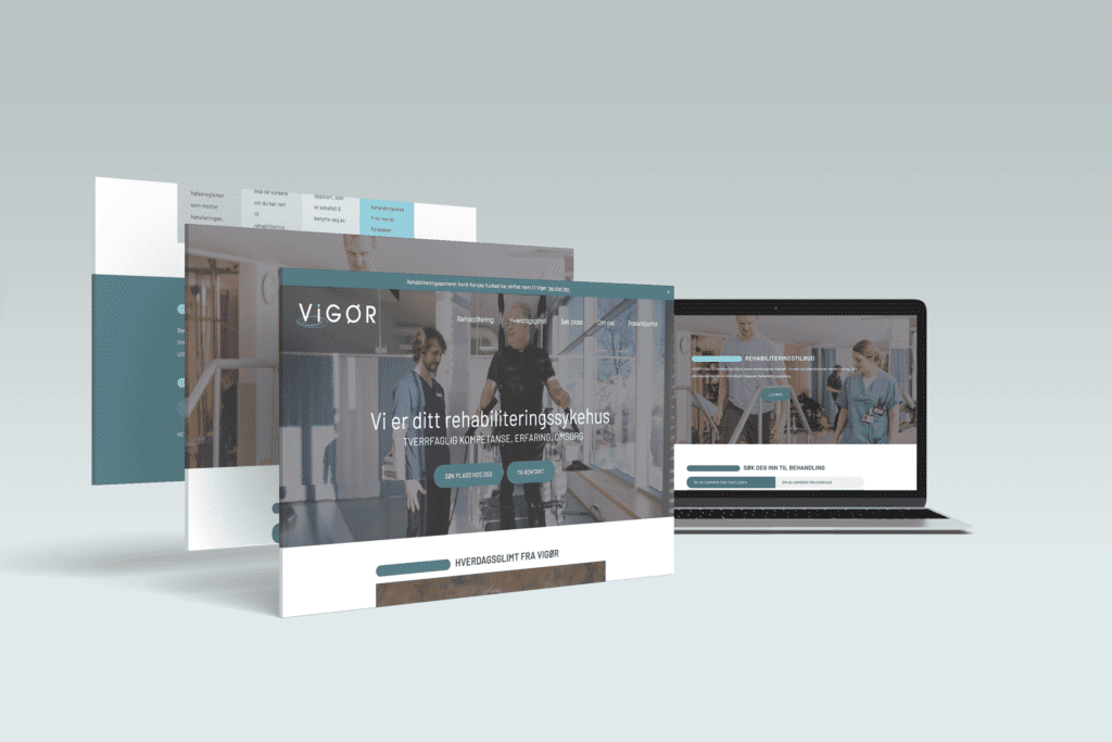
All patient-facing communication was restructured into a shared hierarchy model, aligning terminology, priority, and emphasis across print and digital systems.
Tradeoff: Existing departmental naming conventions were simplified, reducing internal specificity in favour of cross-system consistency.
Identity system as navigation infrastructure
Identity was reframed as a navigation layer rather than a branding system.
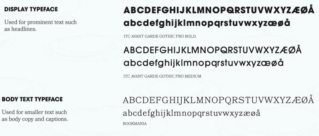
Typography, naming, and tone were tuned to reduce interpretive effort and reinforce spatial clarity.
Tradeoff: We deprioritised expressive brand differentiation in favour of functional legibility across high-stress conditions.
vigour
/ˈvɪɡə/
noun noun: vigor
strength, energy, or enthusiasm: They went to work with youthful vigor and enthusiasm.
strength of thought, opinion, expression, etc.: He gave his side of the story with vigor.
Naming Strategy
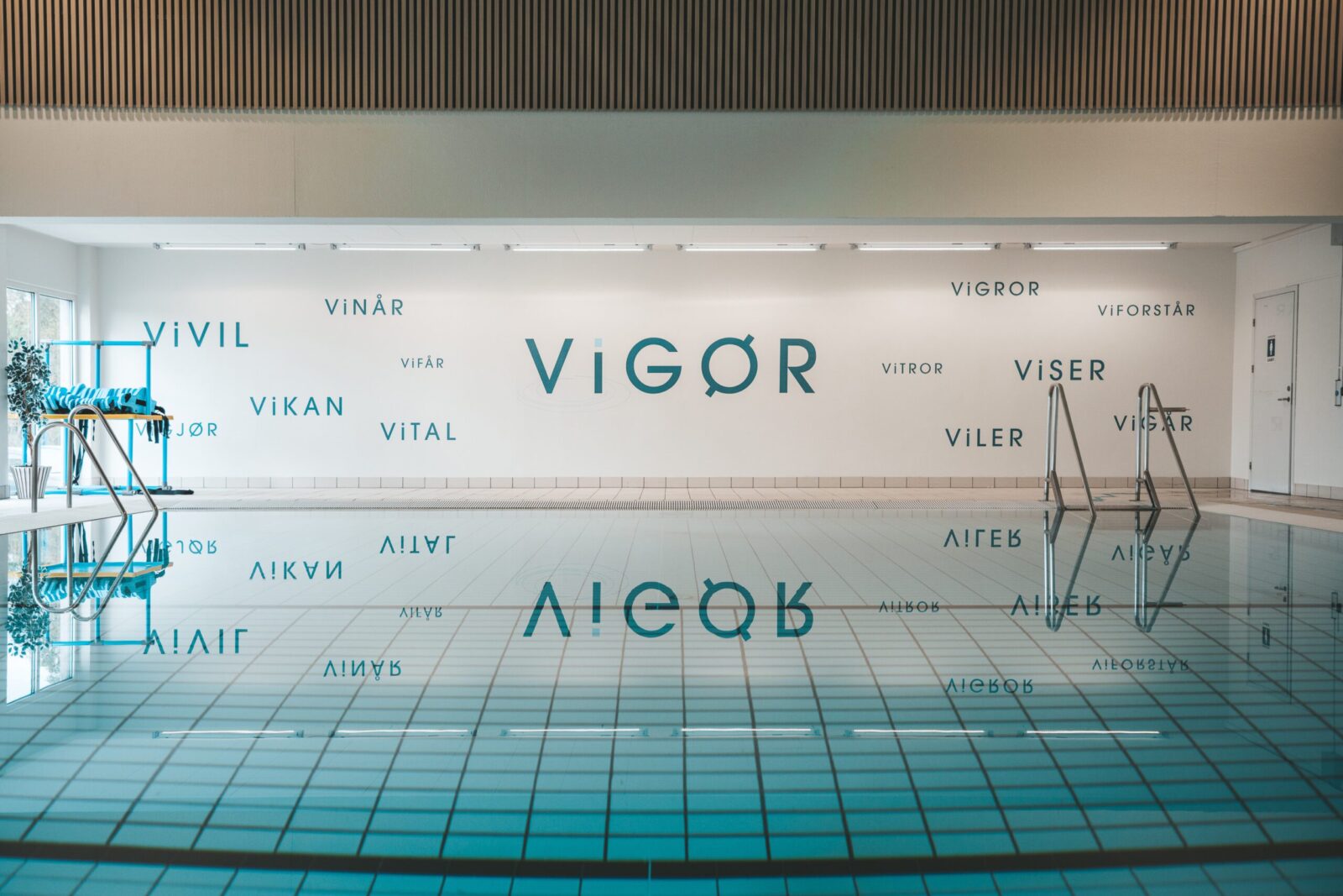
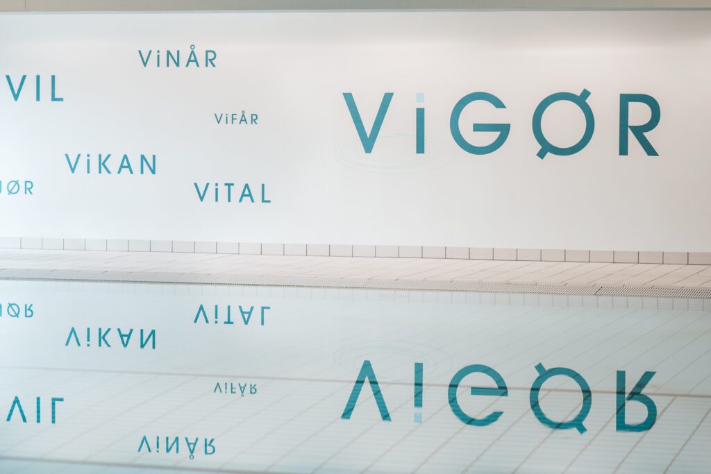
The organisation was renamed Vigør, selected for its brevity, memorability, and association with strength and recovery.
The name functions as a central anchor across environmental, communication, and digital systems, supporting recognition and consistency across the user journey.
Key Design Decisions
Three-tier wayfinding logic
Introduced strict separation between movement, confirmation, and destination information.
Result: reduced hesitation at intersections by removing competing interpretations.
Wayfinding Signage: print-ready directional sign created as part of a larger environmental graphics system to guide visitors through the space.
Environmental zoning system
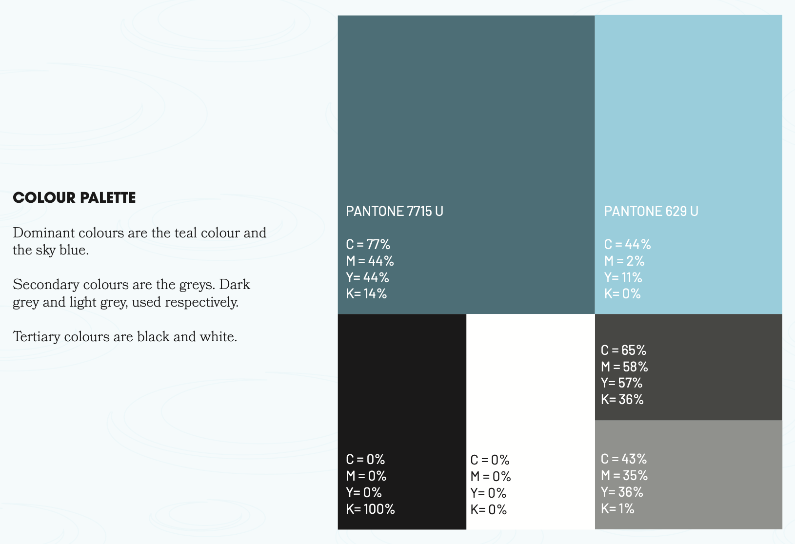
Spatial colour coding enabled pre-attentive recognition of functional areas.
Result: users oriented themselves before reading signage.
Unified hierarchy model
A single prioritisation system governed all information outputs.
Result: eliminated conflicting reading order across touchpoints.
Accessibility-first constraints
Designed for high cognitive load contexts:
reduced visual density at decision points
high contrast typography
simplified linguistic structure
UX-Driven Visual System
The visual system was implemented as an operational layer of navigation.
Neutral grotesk typeface optimised for distance legibility
Controlled contrast system tuned for clinical environments
Colour used structurally for zoning and hierarchy
Minimal visual noise to support fast decision-making
Outcomes
Navigation became more predictable across the facility due to consistent hierarchy rules across environments.
Observed changes included:
fewer re-orientation moments at corridor junctions
reduced reliance on staff for directional support
faster decision-making at entrances and transitions
The system shifted navigation from interpretive to structured, reducing cognitive effort in high-stress contexts.
Reflections
In healthcare environments, failure occurs when systems disagree on what matters most at the same moment.
This project reinforced that clarity is not visual simplicity, it is structural consistency across decision points.
The smallest inconsistencies in hierarchy produce disproportionate breakdowns in trust and orientation.