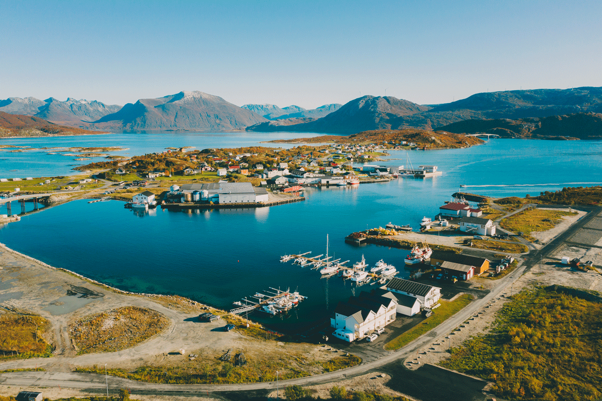
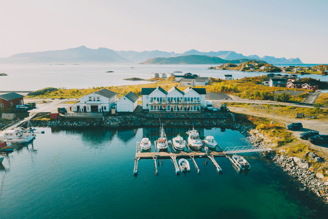
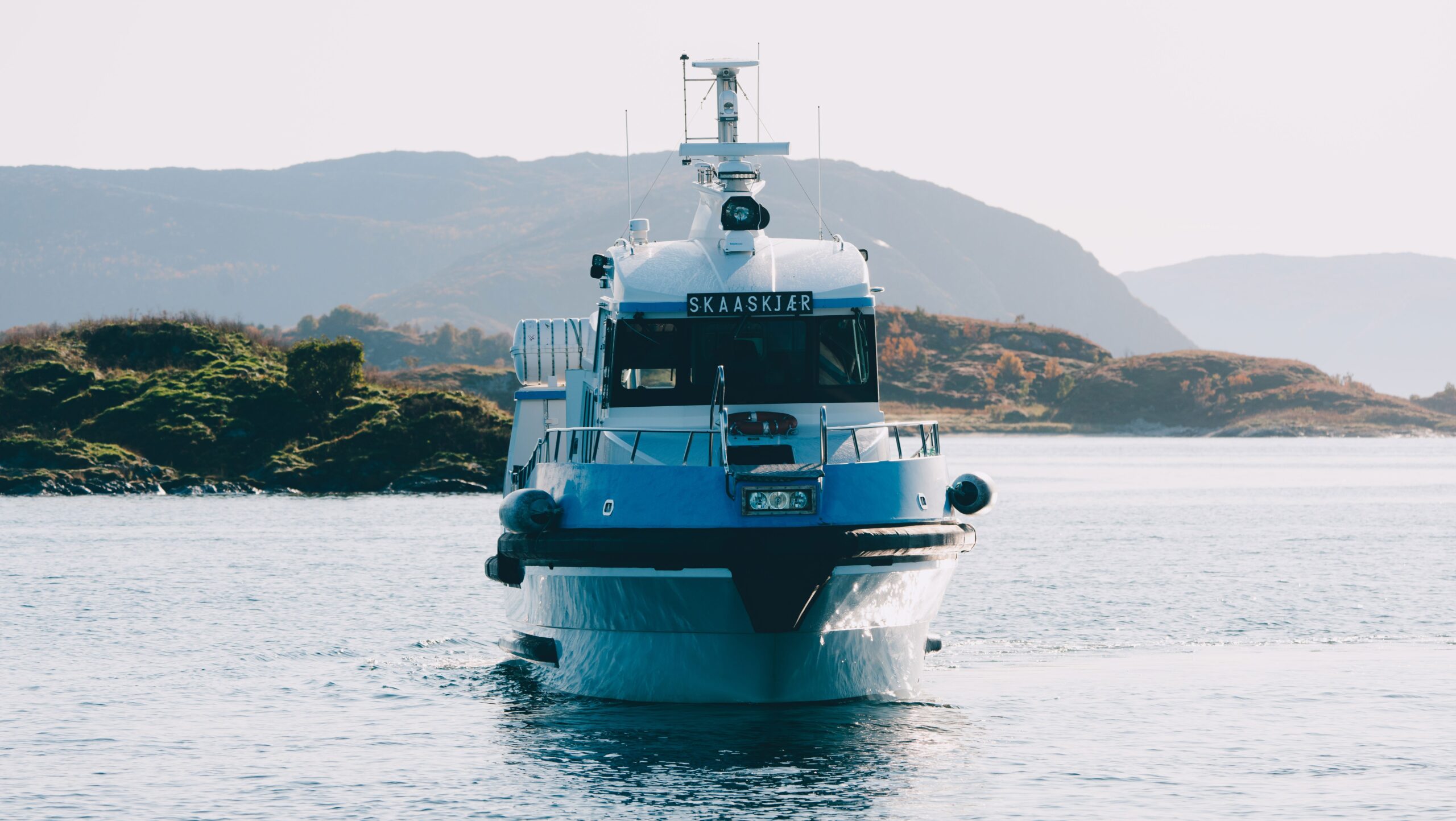
Sommarøy Sea Family is a coastal tourism and accommodation experience spanning discovery, booking, arrival, stay, and departure.
As the offering expanded, digital and physical experiences diverged, creating gaps between online expectation and on-site reality.
This misalignment reduced trust during planning and created uncertainty during arrival and navigation.
I led UX strategy and designed a unified experience system connecting digital, communication, and environmental layers into a continuous journey structure.
Problem
The experience broke across three stages:
expectation formation (digital discovery)
commitment (booking)
physical delivery (on-site experience)
Users encountered inconsistent terminology and structure between digital content and physical environments, resulting in mismatched expectations at arrival.
This created uncertainty during orientation and reduced confidence in decision-making throughout the stay.
Key Insight
The experience was not a sequence of interactions, it was a continuity of expectation over time.
Breakdowns occurred when digital representations of the experience were not structurally aligned with physical reality.
The problem was therefore not usability, but expectation integrity across transitions.
Approach
The journey was analysed as a continuous system with emphasis on transition points:
browsing → booking
booking → arrival
arrival → orientation
orientation → activity selection
Each transition was treated as a handover between systems that must preserve structure, terminology, and hierarchy.
Key constraint: operational systems already in place for booking could not be fully replaced without disruption.
Design Strategy
A unified system was implemented across three layers:
Environmental system
On-site navigation structured through zoning logic and clear spatial hierarchy.
Tradeoff: spatial clarity was prioritised over aesthetic variation, reducing environmental expressiveness to improve navigational predictability.
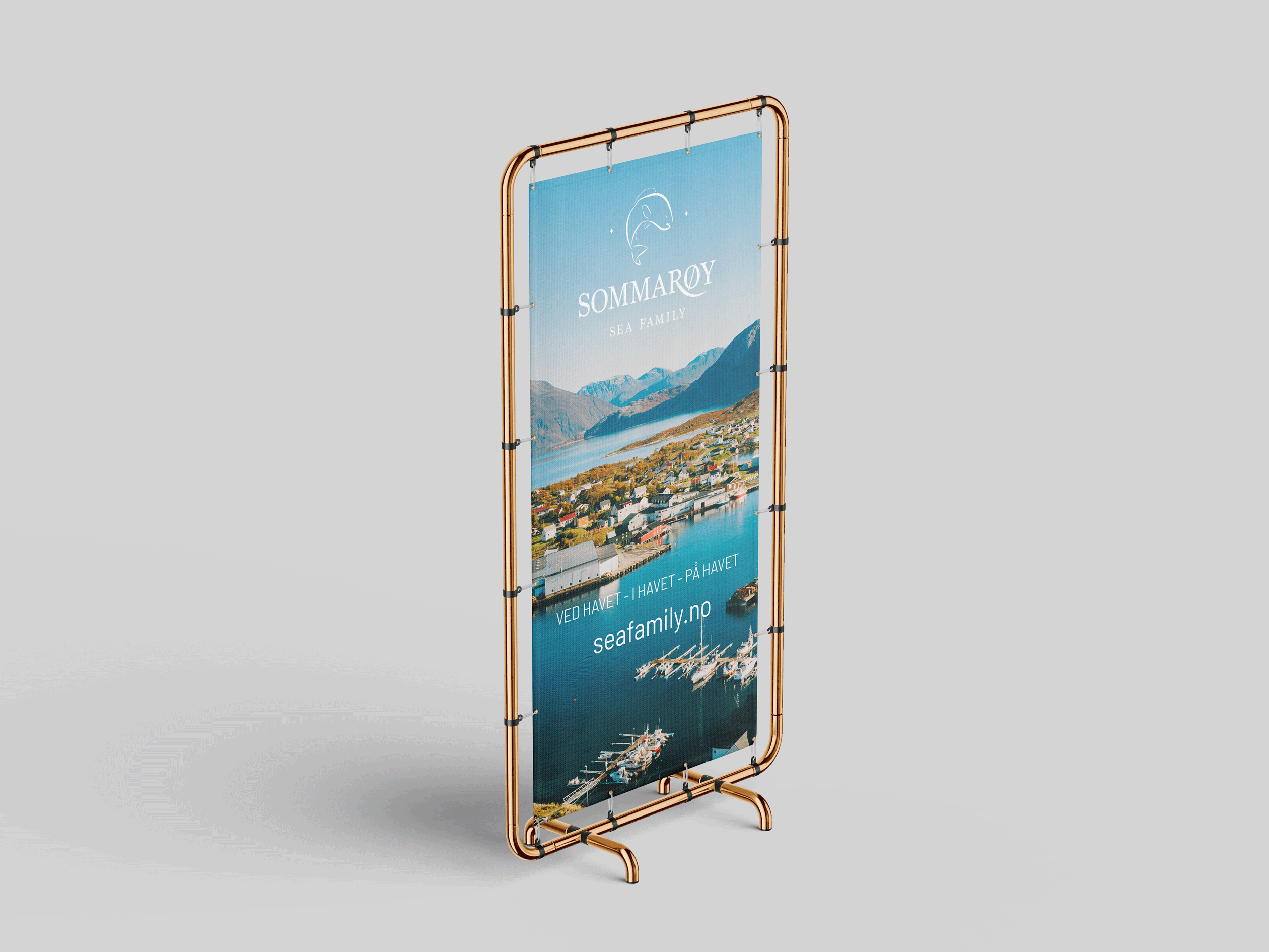
Communication system
Pre-arrival and informational content was standardised to align with on-site terminology.
Tradeoff: marketing language was reduced in favour of operational consistency, limiting promotional tone in key communication moments.
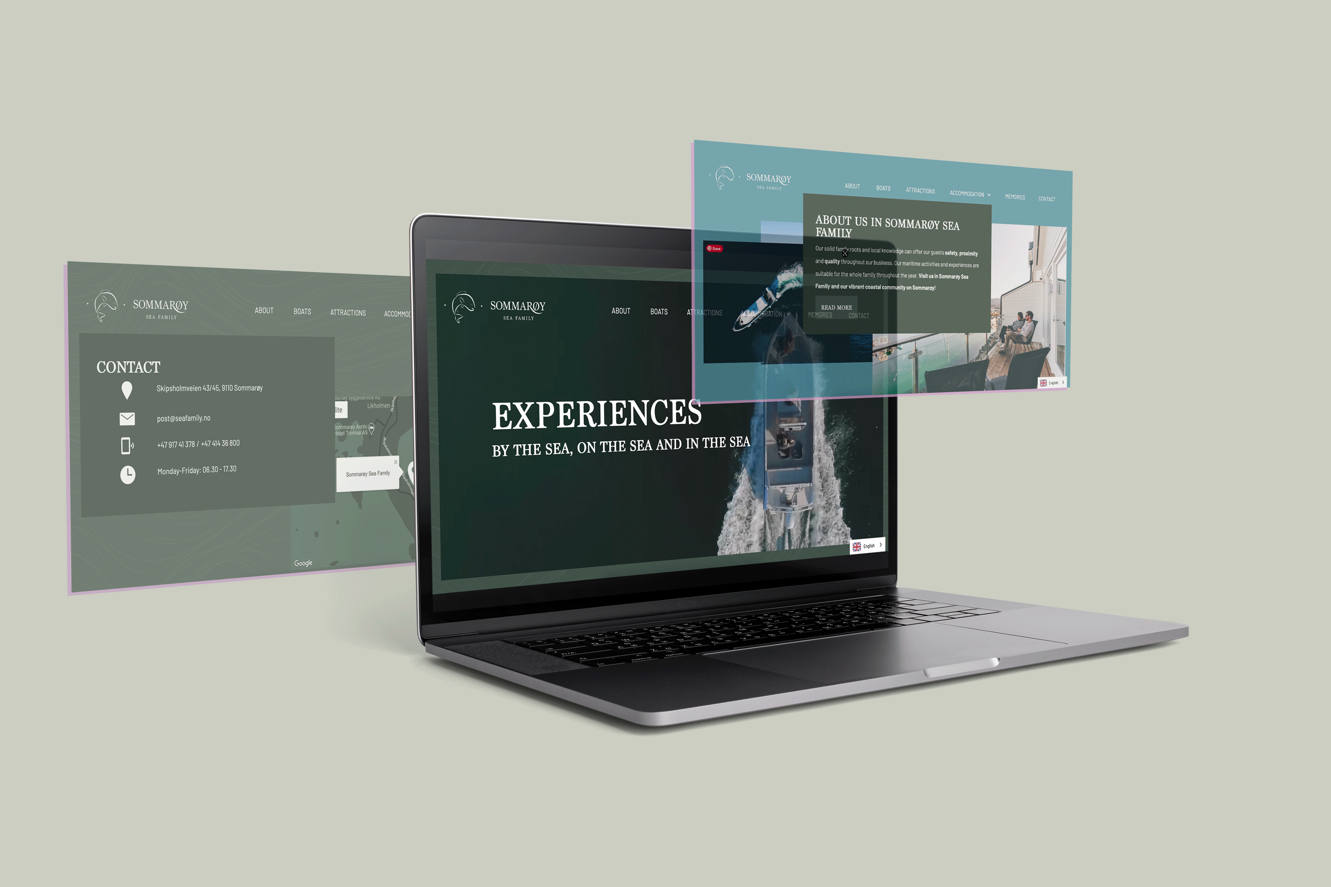
Digital system
The booking experience was redesigned as the first phase of the physical journey.
Structure, naming, and hierarchy were aligned with real-world spatial logic.
Tradeoff: the booking flow was simplified, removing optional exploratory paths to maintain consistency with on-site structure.
Key Design Decisions
Hierarchical information model
Unified structure across all touchpoints reduced cognitive effort in planning and orientation.
On-site navigation system
Zoning and signage logic designed for immediate recognition rather than textual interpretation.
Booking-to-experience alignment
Digital flows mapped directly to physical spaces and activities.
Result: reduced expectation mismatch at arrival.
Cross-channel language system
Unified terminology across all touchpoints ensured continuity of meaning.
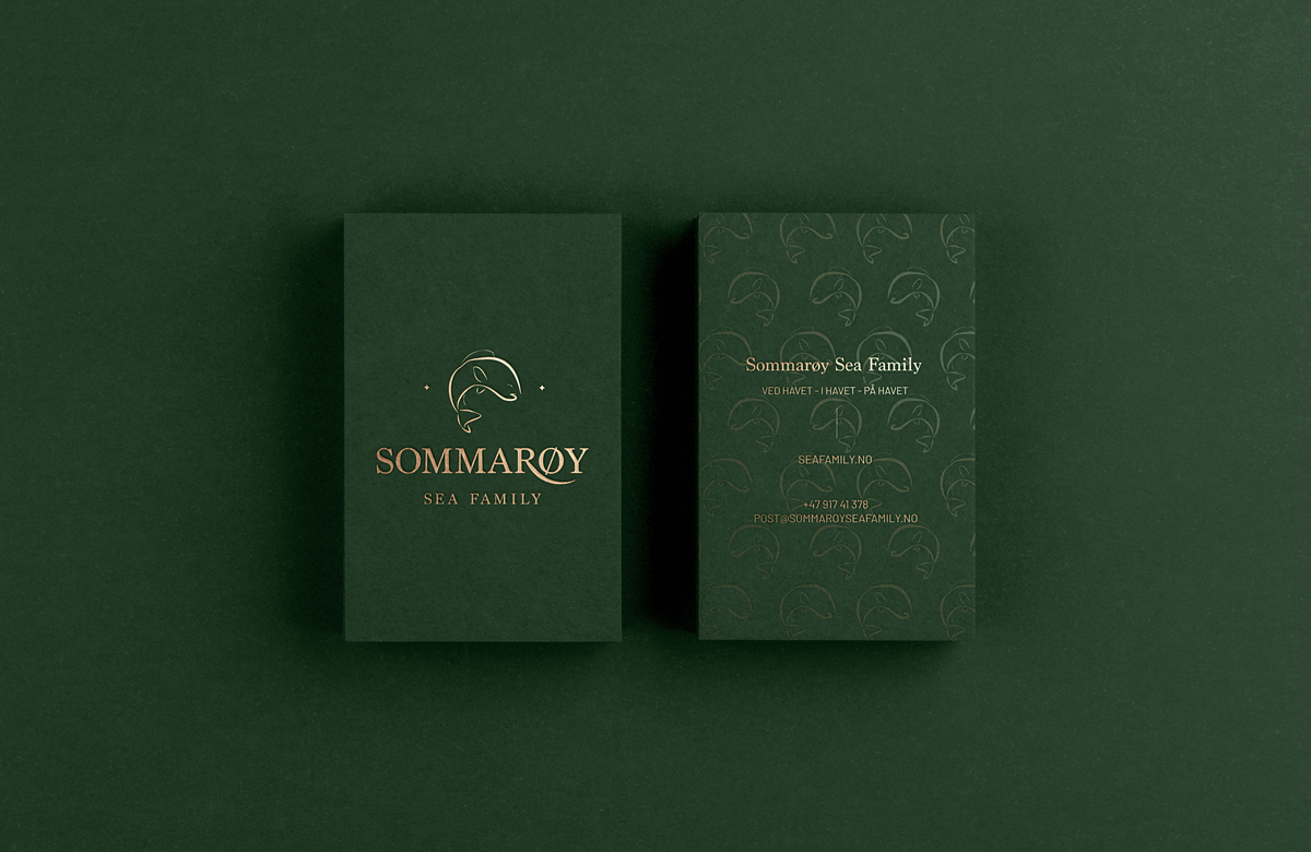
UX-Driven Visual System
The visual system was designed to connect the entire journey:
Serif + sans-serif pairing established hierarchy and warmth
Coastal palette grounded digital experience in physical environment
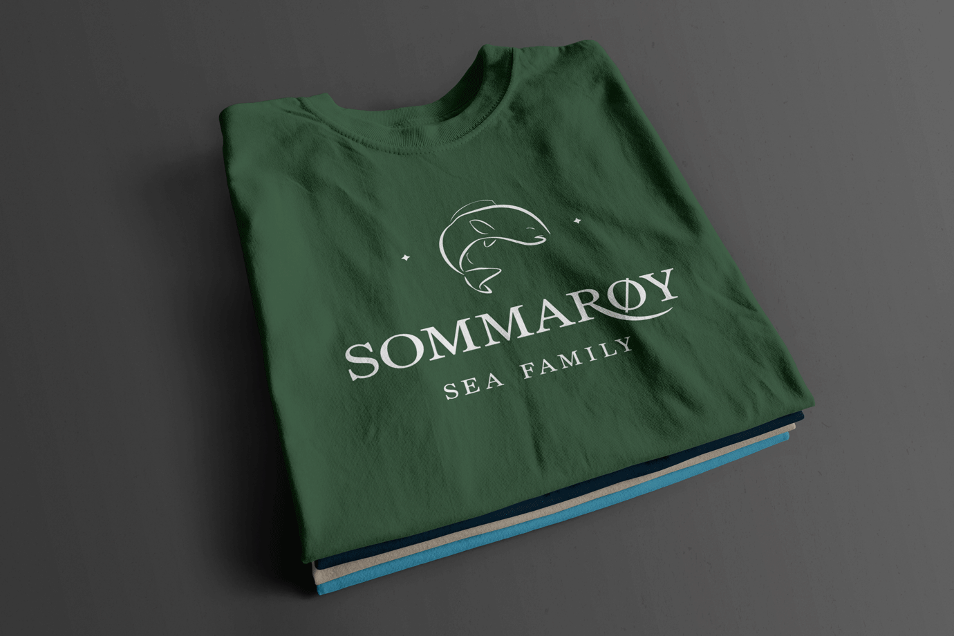
Maritime motifs reinforced recognition across touchpoints
Consistent grid system ensured structural continuity
Outcomes
The experience became structurally continuous from booking to departure.
Observed changes included:
reduced uncertainty at arrival
faster orientation on-site
improved confidence in booking decisions
The journey became legible as a single system rather than disconnected stages.
Reflections
Tourism design is not about individual interactions, it is about maintaining structural continuity between expectation and reality over time.