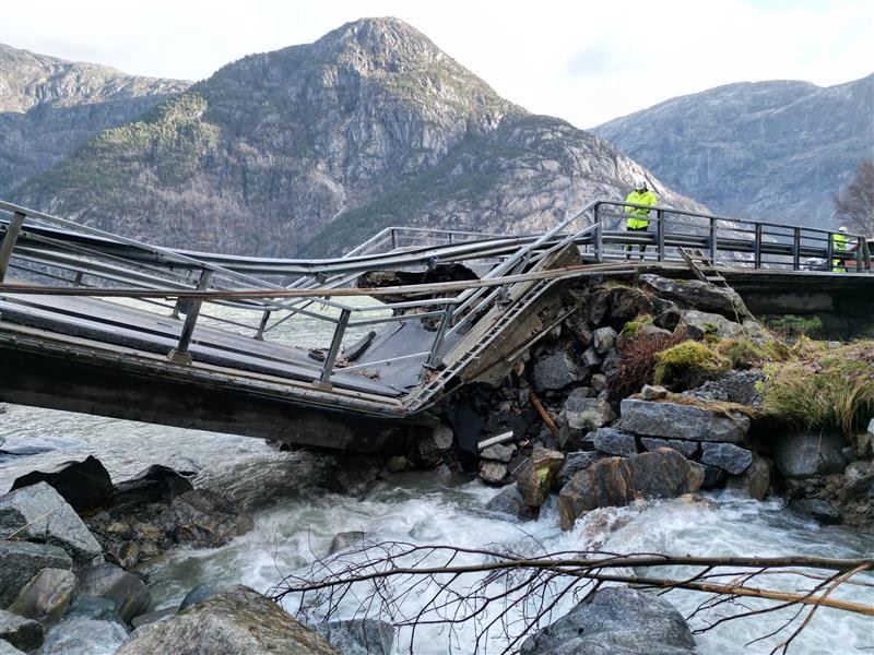
All photos are from: nasjonalrassikringsgruppe.no
Nasjonal
Rassikringsgruppe
Category
โพ NGO
Work
โพ UX Design
โพ Brand Identity Design
Agency
ย โพ Rรธst Kommunikasjon
The National Avalanche Safety Group was established to push avalanche safety to the forefront of Norwayโs political agenda and secure greater national investment in protective measures. The idea emerged during the National Avalanche Safety Conference in Tromsรธ on May 14, 2001, where representatives from Norwayโs most vulnerable counties recognized the need for a unified, coordinated effort to address increasing avalanche risk.
Read more:
Problem & Opportunity
- Fragmented Branding: Previous materials were inconsistent, reducing trust and authority.
- Complex Information Access: Key reports, guidelines, and articles were scattered across channels.
- Stakeholder Communication Gaps: Policymakers and municipal members struggled to find actionable resources.
Opportunity: Create a unified brand and digital platform that consolidates information, supports decision-making, and communicates trustworthiness to all stakeholders.
โVi har ikke rรฅd til รฅ la vรฆre รฅ sรธrge for at vi har sikre og framkommelige veger i Norge. Vi har ikke rรฅd til รฅ miste noen.โ
โ Jenny Fรธlling, leder, nasjonal rassikringsgruppeโ
Role & Goal
Role:
- Led research and synthesized insights to inform UX strategy.
- Mapped user journeys and designed information architecture.
- Developed the visual system and UI components for cohesive digital and print touchpoints.
- Ensured the platform was trustworthy, clear, and accessible for multiple audiences.
Goal:
- Modernize the identity and create a structured, professional platform.
- Communicate avalanche risks and guidance clearly to diverse stakeholders, supporting both decision-makers and the public.
Process
Research & Definition
- Gap Analysis: Reviewed documents and notes to identify inconsistencies and communication gaps across counties.
- User Research: Interviewed stakeholders to understand information needs, accessibility challenges, and decision-making processes.
- Personas & Journeys: Created personas and journey maps to capture user behaviors and long-term decision workflows.
- Content Audit: Assessed existing materials for clarity, hierarchy, and accessibility, identifying opportunities for improvement.
Design & Iteration
- Prototyping: Developed article templates and webpages to simplify complex policy information.
- Expert Collaboration: Worked with regional experts to ensure accuracy and alignment with national safety objectives.
- Refinement: Iterated on structure, language, and visual design based on stakeholder feedback.
Testing & Validation
- Usability Testing: Tested prototypes with stakeholders to ensure materials were understandable, transparent, and actionable.
- Accessibility Focus: Ensured content was usable by both experts and general audiences, supporting informed decision-making.
Challenges & Learnings
- Simplifying Complex Information: Translated technical terms into clear, non-technical language.
- Designing for Multiple Audiences: Balanced accessibility for both policy experts and the general public.
- Maintaining Consistency: Created a unified visual and content identity across all materials to build credibility.
Research & Insights
Primary Users:
- Policymakers & Public Administrators
- Need structured, accessible information to support long-term policy decisions.
- Require clear explanations of why landslide protection is a key national investment.
- Residents, Drivers & General Public
- Want simple, understandable content on how landslide protection improves daily travel.
- Interested in county collaboration for safer roads across Norway.
Pain Points
- Inconsistent terminology makes materials hard to follow.
- Information is scattered, reducing awareness of ongoing initiatives.
- Roles and responsibilities are unclear, weakening understanding of the groupโs purpose.
Insights
- Calm, factual, and consistent communication resonates with all audiences, reflecting the long-term nature of policy work.
- Clear visual hierarchy and structured layouts make complex topics easier to understand.
- Highlighting collaboration between Norwayโs eight most at-risk counties reinforces legitimacy and shared goals.
- A unified design system strengthens credibility, supports policy advocacy, and ensures audiences understand objectives.
Understanding the Users: Personas
๐ฉโ๐ผ
Kari (Policymaker)
Age: 45
ย
Background: Government official responsible for regional safety funding.
ย
Goals: Quickly policy recommendations, understand funding impact.
ย
Pain Points: Too much technical detail, fragmented reports.
ย
Needs: Concise summaries, hierarchical presentation, clear visuals.
๐ข
Erik (Municipal Safety Officer)
Age: 38
ย
Background: Responsible for local avalanche safety plans.
ย
Goals: Apply national safety recommendations locally, report to local government.
ย
Pain Points: Confusing information, inconsistent materials for education.
ย
Needs: Clear templates, standardized visuals, actionable guidance.
โท๏ธ
Sofia (Outdoor Enthusiast)
Age: 29
Background: Ski tourer and mountaineer.
Goals: Understand safety risks, stay updated on news.
Pain Points: Technical language, unclear safety risks for public.
Needs: Plain-language communication, and trusted visual identity.
User Journeys
Each stage highlights opportunities to improve clarity, trust, and actionable understanding for different user types (policymakers, municipal reps, public).
๐
Information Discovery
Introduce the problem clearly for all visitors. Use easy-to-read materials, persuasive visuals, and plain-language explanations to show the risks, consequences, and scale of the issue.
โ
๐๏ธ
Policymaker Engagement
Provide targeted information for decision-makers. Focus on policy recommendations, data-driven insights, and visuals that highlight risk severity and justify specific actions or funding.
โ
๐ขย
Awareness & Public Outreach
Images, plain-language explanations, mobile-friendly content, and visual cues that help the public understand actions and stay informed.
โ
โ๏ธ
Action & Implementation
Policy adoption, funding allocation, and rollout of practical safety measures and innovative monitoring solutions.
โ
UX-Driven Visual System
- Typography: Modern, clean sans-serif that conveys authority and professionalism, ensuring readability across web, print, and signage.
- Colour Palette: Grounded in a neutral base of soft blues and muted complementary tones, conveying calm, reliability, and professionalism.ย
- Hierarchy & Iconography: Distinct typographic hierarchy and minimal lineโart icons mirror the logoโs geometric clarity, guiding users through complex safety information.
- Brand Motif: Circular, quadrant-inspired forms reflect layered avalanche and geological risks, reinforcing safety awareness while maintaining a precise, professional tone.
- Accessibility: High-contrast visuals, plain-language labels, and well-structured layouts ensure clear comprehension for all users, from policymakers to the general public.
Touchpoint Applications
Environmental & Wayfinding
- Clear, high-contrast signage for public info at conference venues or field sites.
Print Materials
- Consistent brochures, and lobbying documents for policymakers and municipal staff.
Digital Interfaceย
- Website aligned with brand principles. Intuitive navigation and downloadable articles.ย
Stakeholder Interaction
Forms and event registration aligned with consistent language and visual cues.
Social & Communication Channels
Social media and newsletters reinforce the brand and provide public awareness.
Website UX Contribution
- Developed clear layouts for policy briefs and public-facing materials.
- Ensured typography, colour, and hierarchy reinforced urgency and credibility.
- Designed visual system for reports, infographics, and communication touchpoints to persuade stakeholders and inform the public effectively.
Outcomes & Impact
๐
Awareness & Understanding
Policymakers and public understand the seriousness of avalanche risks.
๐๏ธ
Clear Communication
Visual hierarchy and structured articles streamline comprehension of risk data.
๐ก๏ธ
Informed Decision-Making
Policymakers have actionable, credible information to prioritize safety measures.
โ
Trust & Credibility
Consistent visual language reinforces authority and reliability of safety messaging.
๐
Public Experience
Users feel informed and guided when accessing safety-critical information.
Key Takeaways
๐งฉ
Functional Branding
The identity is more than visual; it organizes complex information and guides user behavior effectively.
๐
Clarity Across Touchpoints
Consistent typography, colour, and hierarchy reduce cognitive load in multi-channel communications.
๐ค
Inclusive Design
Thoughtful layouts, plain language, and visual cues ensure understanding for all audience types.
๐
Trust & Credibility
Cohesive, consistent visuals reinforce authority and reliability for both stakeholders and the public.
๐
Unified System
Aligning print, digital, and environmental touchpoints creates a seamless, trustworthy experience for every user.
Reflections
- UX and brand identity directly impact understanding and trust.
- Every typographic choice, colour, icon, and layout element influences how complex safety information is interpreted.
- Collaborating with stakeholders, from policymakers to the public, reinforced the importance of clear hierarchy, consistent messaging, and accessible presentation.
- Precision and thoughtful design are essential for conveying critical safety information clearly and confidently.
previous project
next project