
All photos are from: nasjonalrassikringsgruppe.no
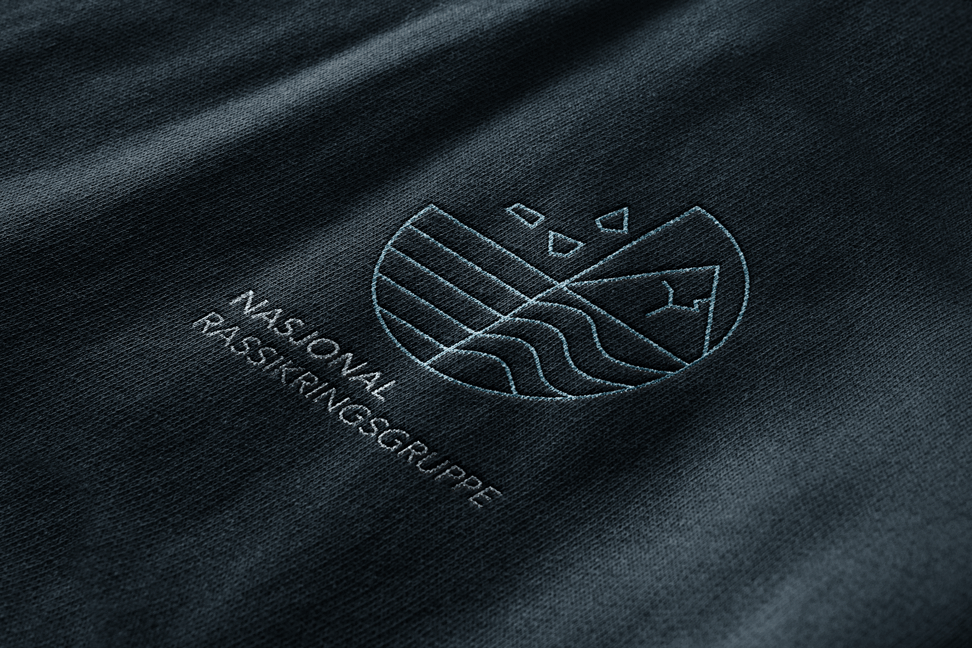
Nasjonal
Rassikringsgruppe
Category
⇾ NGO
Work
⇾ UX Design
⇾ Brand Identity Design
Agency
⇾ Røst Kommunikasjon
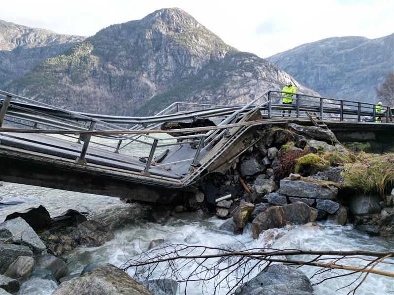
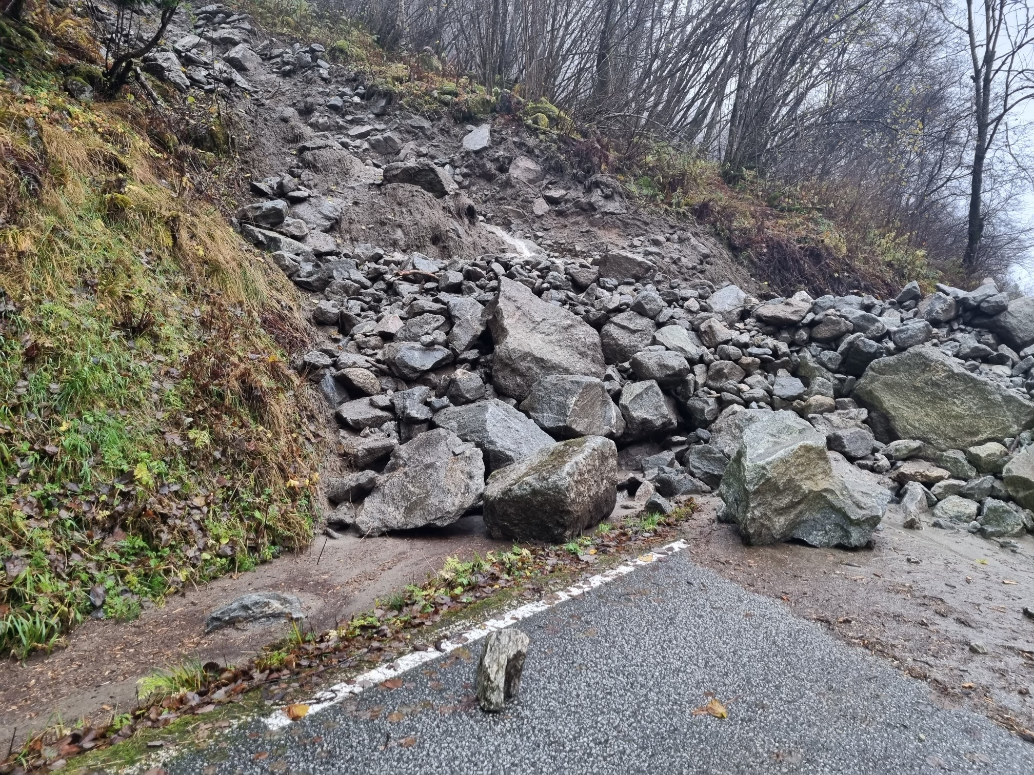
The National Avalanche Safety Group was established to push avalanche safety to the forefront of Norway’s political agenda and secure greater national investment in protective measures. The idea emerged during the National Avalanche Safety Conference in Tromsø on May 14, 2001, where representatives from Norway’s most vulnerable counties recognized the need for a unified, coordinated effort to address increasing avalanche risk.
Read more:
Overview & Role
Nasjonal Rassikringsgruppe (National Avalanche Safety Group) coordinates avalanche safety efforts across Norway, providing information, policy guidance, and public education. The organization needed a cohesive visual identity and digital platform to unify its messaging, support decision-makers, and deliver timely safety updates to the public.
My Role: I conducted research and insight synthesis, defined UX strategy and information architecture, mapped user journeys, and designed visual systems and UI components, creating a clear, trustworthy, and accessible experience for stakeholders.
Goal: Modernize the identity and deliver a structured, professional digital experience that clearly communicates avalanche risks, resources, and actionable guidance for diverse stakeholders.
“Vi har ikke råd til å la være å sørge for at vi har sikre og framkommelige veger i Norge. Vi har ikke råd til å miste noen.”
– Jenny Følling, leder, nasjonal rassikringsgruppe
Process
Research & Definition:
- Reviewed historical reports, conference notes, and stakeholder interviews to identify gaps in communication and trust.
- Conducted user research to understand the needs of policymakers, municipal officers, field rangers, and the public.
- Created personas for key user groups: Kari (Policymaker), Erik (Municipal Officer), Sofia (Outdoor Enthusiast).
- Mapped user journeys: information discovery → report access → real-time alerts → policy decisions → public education.
- Audited existing digital and print touchpoints for hierarchy, accessibility, clarity, and consistency.
Iteration & Testing:
- Developed wireframes and interactive prototypes for the website, dashboards, and report templates, simulating real-world, high-stakes scenarios where timely decisions can impact safety outcomes. Tested how policymakers and field officers interpret alerts and reports under time pressure.
- Conducted stakeholder reviews with municipal officers and safety experts to validate usability and content priorities.
- Iterated navigation, alert visibility, and dashboard layouts based on feedback.
- Tested readability, comprehension, and alert perception in real-world scenarios.
Challenges & Learnings:
- Balancing technical avalanche data with simplicity for non-expert audiences.
- Designing for multiple stakeholders with differing priorities and knowledge levels.
- Maintaining cohesion across digital dashboards, website content, and printed reports.
- Prioritizing accessibility and legibility in high-stakes, time-sensitive contexts.

Problem & Opportunity
- Fragmented Branding: Previous materials were inconsistent, reducing trust and authority.
- Complex Information Access: Key reports, guidelines, and alerts were scattered across channels.
- Stakeholder Communication Gaps: Policymakers and municipal officers struggled to find actionable resources.
Opportunity: Create a unified brand and digital platform that consolidates information, supports decision-making, and communicates trustworthiness to all stakeholders.
Research & Insights
Primary Users:
- Policymakers & Municipal Officers: Need quick access to actionable, credible data.
- Outdoor Enthusiasts & Public: Require timely, understandable alerts and educational materials.
Pain Points:
- Confusing or inconsistent materials and terminology.
- Difficult access to up-to-date reports, guidelines, and alerts.
- Low clarity reduced perceived authority and trust.
Key Insights:
- Users value clarity, trust, and rapid access to information.
- Visual hierarchy, typography, and structured layouts reduce cognitive load.
- A unified system strengthens credibility and user engagement.
Understanding the Users: Personas
👩💼
Kari (Policymaker)
Age: 45
Background: Government official responsible for regional safety funding
Goals: Quickly access key stats and policy recommendations, understand funding impact
Pain Points: Too much technical detail, fragmented documents
Needs: Concise summaries, hierarchical presentation, clear visuals
🏢
Erik (Municipal Safety Officer)
Age: 38
Background: Responsible for local avalanche safety plans
Goals: Apply national safety recommendations locally, report to local government
Pain Points: Confusing templates, inconsistent guidelines
Needs: Clear templates, standardized visuals, actionable guidance
⛷️
Sofia (Outdoor Enthusiast)
Age: 29
Background: Ski tourer and mountaineer
Goals: Understand safety risks, stay updated on alerts
Pain Points: Technical language, unclear signage or alerts
Needs: Plain-language communication, visually clear alerts, consistent branding
User Journeys
Each stage highlights opportunities to improve clarity, trust, and actionable understanding for different user types (policymakers, municipal reps, public).
📄
Information Discovery
- Users: Policymakers, Municipal Officers, Public
- Goal: Find relevant avalanche safety info quickly
- UX Focus: Clean homepage hierarchy, clear headings, search-friendly navigation
➔
📰
Report & Resource Access
- Users: Policymakers, Municipal Officers
- Goal: Access official reports, guidelines, funding requests
- UX Focus: Standardized templates, downloadable PDFs, clear metadata, consistent terminology
➔
💻
Online Alerts & Updates
- Users: Public, Outdoor Enthusiasts
- Goal: Receive current avalanche warnings and safety updates
- UX Focus: Clear alert banners, visual emphasis on risk level, accessible across devices
➔
🏛️
Stakeholder Communication
- Users: Policymakers, Municipal Officers
- Goal: Collaborate, submit feedback, coordinate safety initiatives
- UX Focus: Contact forms, email templates, event registration flow, consistent visual system
➔
📊
Analysis Decision-Making
- Users: Policymakers, Municipal Officers
- Goal: Review data, prioritize funding, track impact
- UX Focus: Dashboards, charts, and summaries that reduce cognitive load, highlight actionable insights
📢
Public Outreach & Education
- Users: General Public, Outdoor Enthusiasts
- Goal: Understand avalanche risks, safety behaviors
- UX Focus: Infographics, simple language, mobile-friendly access, visual cues for key actions
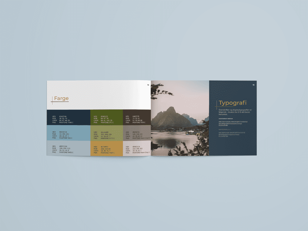
UX-Driven Visual System
- Typography: Clean, professional sans-serif with strong contrast for reports, website, and signage.
- Color Palette: Neutral base with alert highlights (red, yellow) to convey urgency without overwhelming.
- Hierarchy & Iconography: Clear typographic hierarchy and simple icons guide users through complex information.
- Brand Motif: Avalanche-inspired angular shapes reinforce safety awareness while maintaining professional tone.
- Accessibility: High contrast, plain-language labels, structured layouts for easy comprehension.
Touchpoint Applications
Environmental & Wayfinding
Clear, high-contrast signage for public info at conference venues or field sites.
Print Materials
- Consistent reports, brochures, and safety guidelines for policymakers and municipal staff.
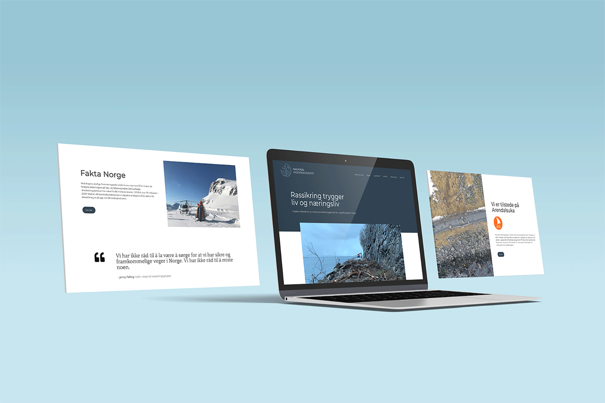
Digital Interface
- Website and dashboards aligned with brand principles. Intuitive navigation, transparent alerts, downloadable reports.
Stakeholder Interaction
Forms and event registration aligned with consistent language and visual cues.
Social & Communication Channels
Social media and newsletters reinforce the brand and provide public awareness.
Website UX Contribution
- Defined typography hierarchy and font usage.
- Set color and contrast guidelines for readability and accessibility.
- Recommended navigation labels aligned with stakeholder mental models.
- Defined components, grids, and spacing for consistent layouts.
- Ensured digital experience mirrored the calm, professional tone of the brand.
Outcomes & Impact
🔎
Rapid Comprehension
Stakeholders and the public can locate critical avalanche safety information quickly.
🗂️
Efficient Access
Clear visual cues, hierarchy, and layout streamline wayfinding across website, dashboards, and printed materials.
🛡️
Trusted Information
High contrast, plain-language labels, and structured content support diverse users, from policymakers to outdoor enthusiasts.
✅
Consistency
Unified visuals and messaging convey authority, reliability, and professionalism.
📊
Confident Decisions
Clear, organized design increases confidence in interacting with reports, and safety guidance.
💛
Reassurance Experience
Users feel guided and supported when accessing safety-critical information, reducing stress and uncertainty.
Key Takeaways
🧩
Functional Branding
The identity is more than visual; it organizes complex information and guides user behavior effectively.
📏
Clarity Across Touchpoints
Consistent typography, color, and hierarchy reduce cognitive load in multi-channel communications.
🤝
Inclusive Design
Thoughtful layouts, plain language, and visual cues ensure understanding for all audience types.
🔑
Trust & Credibility
Cohesive, consistent visuals reinforce authority and reliability for both stakeholders and the public.
🔗
Unified System
Aligning print, digital, and environmental touchpoints creates a seamless, trustworthy experience for every user.
Reflections
Designing for avalanche safety reinforced how brand identity and UX can directly influence critical decision-making. Every typographic choice, color highlight, icon, and layout element impacts clarity, trust, and stakeholder action in high-stakes contexts.
I learned that in safety-critical systems, precision, consistency, and structured communication are paramount. Even small inconsistencies can reduce confidence or delay action, so designing with hierarchy and visual guidance is essential.
Working with diverse stakeholders, from policymakers to the public, underscored the importance of tailored communication that balances detail with accessibility.
This project reinforced how UX and brand identity can directly influence safety-critical decision-making. Every typographic choice, alert color, icon, and layout element impacts comprehension and stakeholder confidence under time-sensitive conditions. I learned that clarity, structured hierarchy, and precise communication are essential when lives and public safety depend on the timely interpretation of complex data.
previous project
next project